December 08, 2009
New Medieval Galleries at the V&A
The reviews are coming in for the newly reopened Medieval and Renaissance Galleries at the Victoria and Albert Museum (commonly known as the V&A) in London, England. This review of the V&A's Medieval & Renaissance Galleries in the Telegraph is pretty typically glowing.
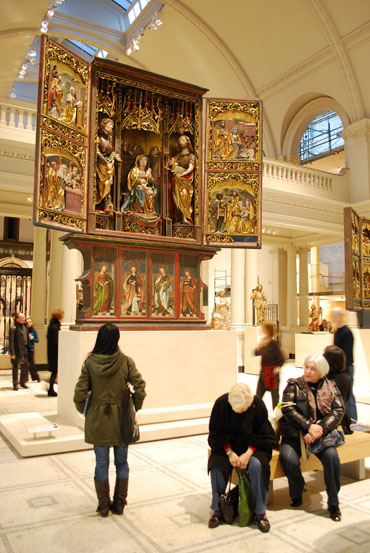
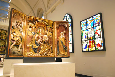
But I'm not so sure. The collection is amazing, truly one of the very best in the world. But from the photos I've seen of the exhibition space, something strikes me as wrong.
Flickrite Sam the Sham and the Photos
My first uneasy impression - Why all the white?
A minor rant and a few more images below the fold...
Butterfly Collection versus Theme Park Ride
The V&A collection of medieval art and stained glass is one of the best in the world. But I do wonder if the reviewers are praising the collection and not the exhibition. This video from the Guardian was the first thing I saw of it and it shows lots of the white walls in a very brightly lit space.
My concerns about the white space started to clarify when I read this article from the Guardian website, with the curious title of In this mist of antique loveliness, the object is all. For history go elsewhere. In the article Simon Jenkins praises the exhibition while also pointing out the issue of context. He contends that the V&A has a fear of putting the art works in any kind of context. That nay context would turn the whole exhibit into a theme park ride, tagging it with the dreaded title of 'Disneyland'.
I contend that the V&A has gone too far in the other direction and the whole thing comes off as a terribly stark and sterile, brightly-lit butterfly collection.
In the end, Simon Jenkins suggests it's not that important and his only response is 'museums can't do everything'.
I would argue that surely there can be some kind of compromise between the butterfly collection approach and the theme park ride approach. Maybe even start by getting rid of the harsh snarky metaphors.
One area where I would hope there could be compromise is with light levels. In the new modern approach, the light levela seem way too high. Can that be toned down without losing integrity?
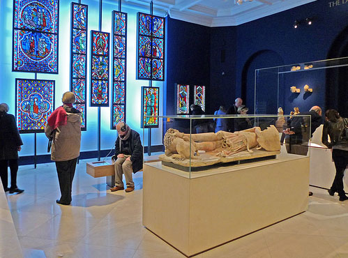
Flickrite Where the Art is
This lightbox setup for the stained glass is especially galling. To see the amazing V&A collection of stained glass just popped in front of a big single stark white plexiglass light box chills my spine. At least some of the stained glass is placed in individual light boxes so you are not seeing the panels with a stark white light surrounding them, though there is still a stark white wall. Was there any attempt to find a way to display this incredible collection in natural light?
Flickrite Sam the Sham and the Photos
Obviously, I reserve final judgement on seeing the new galleries in person, but I'm concerned that the concept of how to display these works of art was ill-conceived. From what the Jenkins articlel suggest, it's from the fear of looking like a theme park. My own hunch is that 'light, bright and airy' modern museum spaces are easier to sell than dimly lit medieval spaces in our day and age. So they fit the medieval collection to what people expect in a modern museum, which means light and airy atrium spaces.
Personally, I wish they had designed the space to fit the needs of the collection, not the marketplace.
Posted by Tom at December 8, 2009 10:06 PM