November 29, 2006
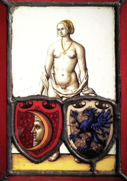
Enigmatic Stained Glass at the SLAM
I saw this at the St. Louis Art Museum on the same day I saw the new Medieval Galleries. Not much solid info about it really. It comes from Nuremberg Germany, dates from about 1535 and might be by Augustin Hirschvogel. The shields are of the Ollinger and Gruner families.
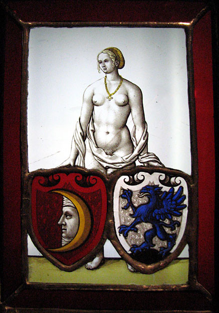
This panel is striking in a number of ways. First, the size. It's really tiny. Without the border this it is only about 4 inches across and 6 inches high.
The painting is lovely, and especially amazing at that scale. The composition is unusual and enigmatic. It's suggested that it's a marriage (or family merger) panel, with the figure representing 'Fortune' and the shields representing the two families. For a figure representing 'Fortune', the expression strikes me as a bit mournful. I guess Fortune doesn't necessarily mean good fortune. I like panels that have a story to tell, and this one has a story to tell. I only wish I knew what it was.
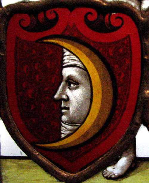
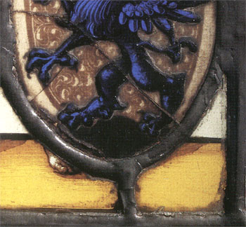
detail of the moonface shield -
A fun and fascinating little panel to muse on.
Also of note -
This panel was featured in the book for the exhibit Painting On Light. I have the book but never saw the exhibit, alas.
I would not usually do this, but I scanned this following image from the book. I did it to point out the difference. Since the photo was made for the book there has been restoration work done on the panel. Note the lower left area. So it seems the eagle herald and the lower horizon glass piece have been edge-glued and the whole thing releaded. The new leadlines also have a warmer color to them. I assume they put a patina on them using copper sulfate. I wonder why? It almost makes it look like the relead was done in copper foil, but I find that hard to believe. I hope it's just that all the leads were tinned and they felt the warmer tone was age appropriate. I'd have to go back and give it a closer and longer look.
and the detail
[update March 2007 - I took another look at the panel and there is no question that the panel was reassembled using the copper foil method. Why? It seems like such a blatant example of a wrong conservation decision. Granted that no one in the St. Louis area except myself will notice or care about this, but still. Isn't a work of art supposed to be restored in some way close to its original state? That the material used for the leadlines be appropriate for the time the panel was made is important.]
November 27, 2006
Medieval Glass at the SLAM
Another visit to the St. Louis Art Museum and another new find. I'd heard they had opened up a new 'Medieval Gallery', but I hadn't heard there was anything new (to me) on display. So, I was surprised when I stumbled upon the gallery the other day and, lo and behold, they now have on display some stained glass that I didn't know was in the collection. Very nice.
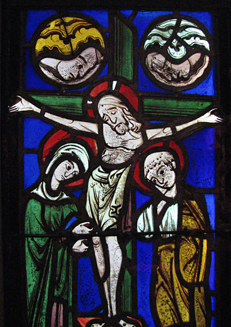
This was the first thing to strike my eye. Described only as French, 12th Century, I believe. A rather 'cool' looking crucifixion. Crucifixion scenes are relatively rare in stained glass and I find this one rather curious. The figure of Jesus almost seems more in a state of sad revery or meditation rather than in one of suffering. I love the linework throughout. I'm curious about the two face/figures above the cross - angels peeking through the clouds? It doesn't ring a bell iconographically.
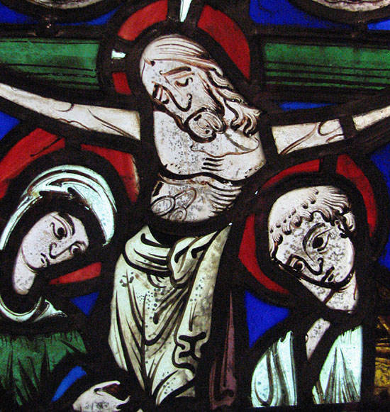
and a detail -
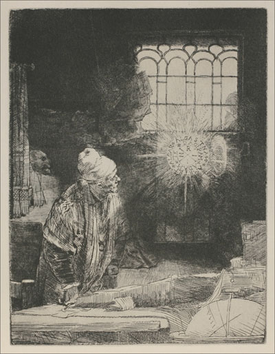
November 14, 2006
Rembrandt at the SLAM
It's not directly SG related, still - great art is great art and this is great art. Sometimes just too obvious to avoid. I went this past weekend to the Rembrandt Etchings Show at the St. Louis Museum of Art. Amazing. Seeing Rembrandt etchings some 25 years ago (when I finally saw the real thing and not just reproductions in books) were among the milestones that solidified my desire to be an artist. You really do have to see the real thing. In my opinion, the finest reproduction does not do them justice. It does seem odd, since they are meant to be reproducable. Yet in these particular prints, the sharpness of the line and the texture of the ink and paper is just not the same in a book... and never never even close in a mere web image.
Just go there and see them. The museum is wise and courteous enough to supply the magnifying glasses...
Faust