November 12, 2004
German Expressionism - Ripe for Translation 2
I've long seen the potential for stained glass design in the works of the Expressionist painters and printmakers of the first half of the 20th century. The art features a strong use of black, vivid color, and a content filled with intense emotional figurative content.
There seem to be few stained glass windows made in that period or in that style. The only one I've ever see by a German Expressionist of that era is a window by Max Pechstein at the Busch Reisinger at Harvard. And they do not have a picture (or a mention) on their website and I never got a picture of it when I lived in Boston. I seem to remember it being a good size window (perhaps 3 feet wide by 8 feet tall?) with a female figure and some stylized animals. I remember there being an interesting use of flashed glass effects but I also remember the figure not being too striking. I'm not sure if the window was made before or after World War 2. I know Pechstein made other windows but I've never seen any pictures of them.
There tends to be so much more attention focused on the Post-war German glass artists than on Pre-war glass artists. Post War German stained glass artists mostly work in abstract or stark austere designs. Hardly ever figurative at all - Stockhausen being the only exception I'm aware of.
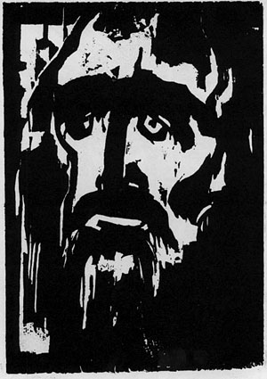
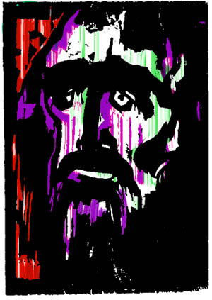
By way of demonstration - I've been playing with an image by Emil Nolde. A woodcut that always struck me as an image that could easily translate into stained glass.
Original woodcut print by Emil Nolde -
One 'Expressionistic' color possibility -
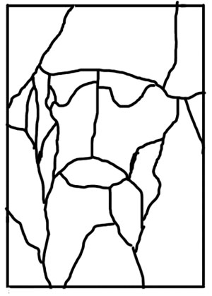
The leadline would be very simple using flashed glasses -
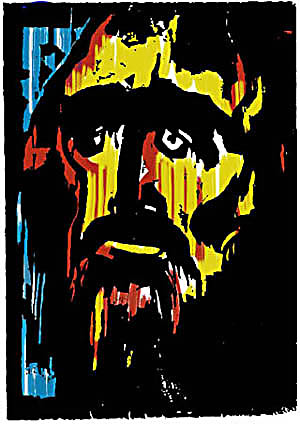
Now the coloring on this is actually more conventional, with blue for 'sky' or background and red seeming to symbolize 'blood'. Nolde himself, in his colorwork, very often did not go with natural or logical colors. That is, a background might just as easily be a bright harsh yellow as any other and a bright green might be on the face. So, here is another color possibility - perhaps more in line with the expressionistic dissonance of color -
Now if this were made into a more traditional, purely mosaic, style stained glass window - with color seperation NOT happening throught the use of flashed glass or colored enamel. The result might be more like this - the gradation of color could be acheived by careful selection of glass -

In this case the leadwork would be more complex, something like this