June 19, 2008
Max Pechstein Stained Glass at the Busch Reisinger
I've posted about expressionism and stained glass before and mentioned that I had seen a window by Max Pechstein but did not have any photos. I finally took some photos and finally got around to posting them.
Max Pechstein (also a wikipedia entry)
at the Busch Reisinger Museum, in Cambridge, Mass., USA.
photos by me, circa 2006
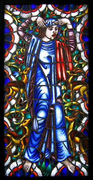
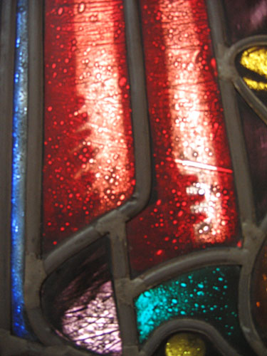
It's called "Woman with Animals" and is dated from 1912. No other background information was given on the wall placard and I could find no other info on the web. Still, I have detail photos and a little context...
[update: June 29, 2008 - I guess this panel will not be on display for awhile since the building housing it, Otto Hall, though only 17 years old, is being demolished, because of structural defects that happened due to an elaborate climate control system that failed. Personally, I never much liked Otto Hall and much preferred it when all the Busch-Reisinger collection was displayed in Adolphus Busch Hall, un-modern and non-climate controlled as it was.]
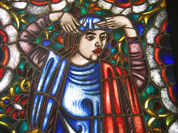
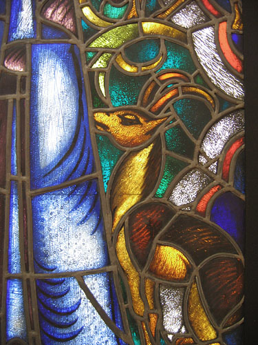
Almost all of the pieces in the clothing of the figure is acid etched flashed glass, while none of the glass in the background or the glass for the animals is etched.
For some context - in the gallery.
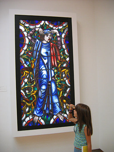
My then 7 year old daughter Gwyneth looking at the panel with her pocket kaleidoscope.
The Flickr search for 'Pechstein stained glass' yielded this panel form the Brucke Museum in Germany.
I wonder if it's the quality iof the photo or is this really much darker and indistinct.
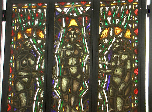
Three Female figures flickr search
Pechstein as Printmaker
Yikes, They never published anything like this in my Sunday school textbook. These rather striking prints are part of a 12 print group illustrating the The Lord's Prayer (Das Vater Unser), from 1921.
Now these images are images I would like to see turned into stained glass, if only as an exercise in translation.
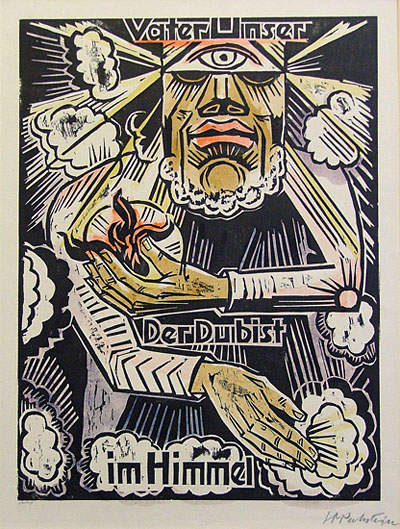
The text for this particular print translates as"Our Father, who art is Heaven".
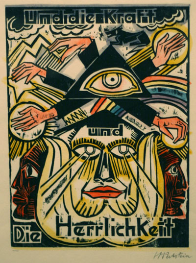
This text here translates as "The Power and theGlory".
The whole series can be seen on this Flickrset on Max Pechstein Prints and referred to in his Blogpost about seeing the prints at the new German Expressionist Exhibit at the Los Angeles County Museum of Art.
March 10, 2007
The Viking Ship at the SLAM
I went this weekend to see the new exhibit called Waking Dreams: The Art of the Pre-Raphaelites from the Delaware Art Museum at the St. Louis Art Museum. I had been anticipating this exhibit mainly because I was curious to see if there was going to be any stained glass incorporated into the exhibit. There is one stained glass panel, designed by Edward Burne-Jones and fabricated by Morris & Co., and it's a good one.
The Viking Ship, 32" x 31.5", 1883-84
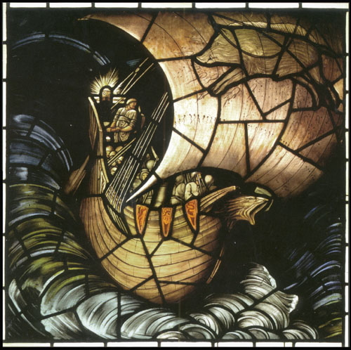
The photo (a scan of the postcard as no photography is allowed at the exhibit) does not begin to do justice to this window. The colors are even more subdued in the real thing. In fact, it is amazing how much is accomplished on what is a very limited color palette. A few shades of tan, and a limited range of blues are all there is. But the richness and dynamic quality is amazing.
There is a substantial use of yellow silverstain used throughout. Any of the greens you see in the water were created by doing the silverstain on blue. The orange on the ship's banners is done with a dark stain. There are bits and pieces of stain throughout the whole piece. I would guess that a good 7o percent of the pieces have at least a touch of stain.
The painting, in particular, is superb, both in line and tone. Note that in the case of his stained glass work, Burne-jones would only have done the design. The painting, fabrication and, in large part, the color selection was done by Morris & Co, with one source crediting the glass painting to John Henry Dearle. There is one cartoon by Burne-Jones at the exhibit and there is surprisingly little detail in the design, only a roughly drawn figure with no background detail at all. I have seen other Burne-Jones cartoons that are more detailed, but those may have been at later stages, as apparently Burne-Jones mainly drew the figures and others drew in the rest.
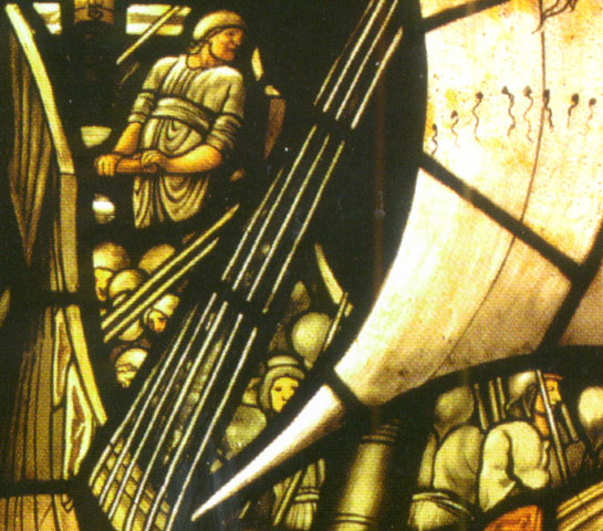
Some closer views
More information on this panel can be seen at this docent page on the Delware Art Museum website.
The panel was created for a residence in Newport, Rhode Island, USA called "Vinland", and was part of a group of nine panels in three rows of three panels, the viking ship being top row center. There is a small picture in the exibition book showing a sketch for the entire program. The lower six windows featured figures from Nordic legends. Curiously, I could find no mention in the exhibition book or on the web as to what happened to the rest of the window.
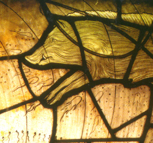
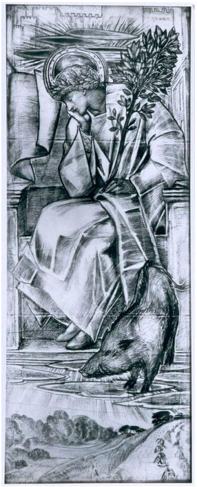
I did find this cartoon of another section of the window - of Freya. The wikipedia article on Freya states that "she was a goddess of love, beauty, sex, and attraction. Freyja was also a goddess of war, death, magic, prophecies and wealth." Whew, I guess that's why she looks so tired. Note the boar, corresponding with the boar on the sail of the ship. His name is Hildisvini, which means 'battle swine'.
Sketch from the Birmingham Museum of Art -
You can download the ipod tour on the SLAM website, or you can go to this introduction page that links to six excerpts from the ipod tour, including one specifically for 'The Viking Ship'.
A nice feature, though the ipod tour is not terribly informative, especially in terms of the stained glass. The Delaware Art Museum Pre-Raphaelite docent pages have much more information.
November 29, 2006
Enigmatic Stained Glass at the SLAM
I saw this at the St. Louis Art Museum on the same day I saw the new Medieval Galleries. Not much solid info about it really. It comes from Nuremberg Germany, dates from about 1535 and might be by Augustin Hirschvogel. The shields are of the Ollinger and Gruner families.
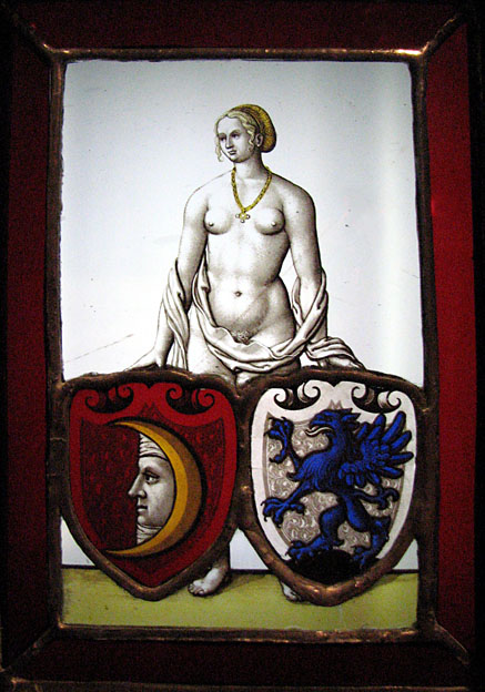
This panel is striking in a number of ways. First, the size. It's really tiny. Without the border this it is only about 4 inches across and 6 inches high.
The painting is lovely, and especially amazing at that scale. The composition is unusual and enigmatic. It's suggested that it's a marriage (or family merger) panel, with the figure representing 'Fortune' and the shields representing the two families. For a figure representing 'Fortune', the expression strikes me as a bit mournful. I guess Fortune doesn't necessarily mean good fortune. I like panels that have a story to tell, and this one has a story to tell. I only wish I knew what it was.
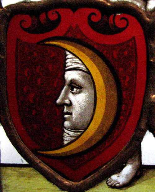
detail of the moonface shield -
A fun and fascinating little panel to muse on.
Also of note -
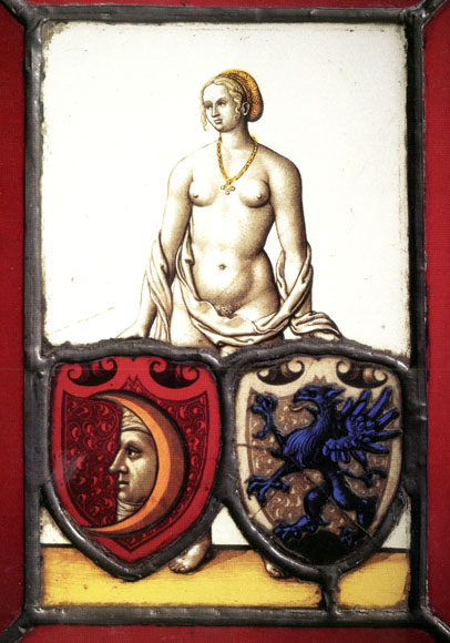
This panel was featured in the book for the exhibit Painting On Light. I have the book but never saw the exhibit, alas.
I would not usually do this, but I scanned this following image from the book. I did it to point out the difference. Since the photo was made for the book there has been restoration work done on the panel. Note the lower left area. So it seems the eagle herald and the lower horizon glass piece have been edge-glued and the whole thing releaded. The new leadlines also have a warmer color to them. I assume they put a patina on them using copper sulfate. I wonder why? It almost makes it look like the relead was done in copper foil, but I find that hard to believe. I hope it's just that all the leads were tinned and they felt the warmer tone was age appropriate. I'd have to go back and give it a closer and longer look.
and the detail
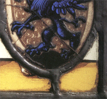
[update March 2007 - I took another look at the panel and there is no question that the panel was reassembled using the copper foil method. Why? It seems like such a blatant example of a wrong conservation decision. Granted that no one in the St. Louis area except myself will notice or care about this, but still. Isn't a work of art supposed to be restored in some way close to its original state? That the material used for the leadlines be appropriate for the time the panel was made is important.]
November 27, 2006
Medieval Glass at the SLAM
Another visit to the St. Louis Art Museum and another new find. I'd heard they had opened up a new 'Medieval Gallery', but I hadn't heard there was anything new (to me) on display. So, I was surprised when I stumbled upon the gallery the other day and, lo and behold, they now have on display some stained glass that I didn't know was in the collection. Very nice.
This was the first thing to strike my eye. Described only as French, 12th Century, I believe. A rather 'cool' looking crucifixion. Crucifixion scenes are relatively rare in stained glass and I find this one rather curious. The figure of Jesus almost seems more in a state of sad revery or meditation rather than in one of suffering. I love the linework throughout. I'm curious about the two face/figures above the cross - angels peeking through the clouds? It doesn't ring a bell iconographically.
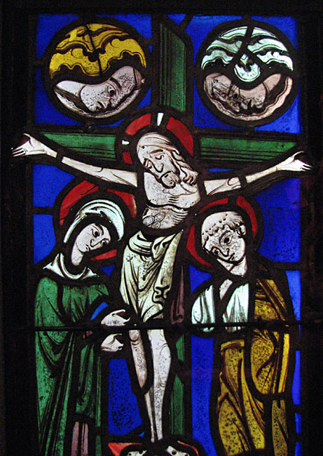
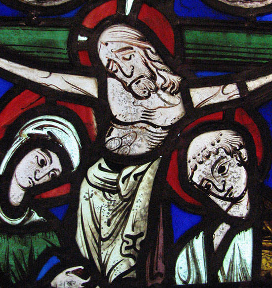
and a detail -
November 14, 2006
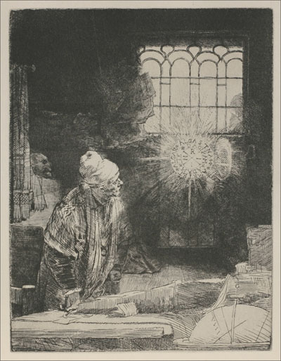
Rembrandt at the SLAM
It's not directly SG related, still - great art is great art and this is great art. Sometimes just too obvious to avoid. I went this past weekend to the Rembrandt Etchings Show at the St. Louis Museum of Art. Amazing. Seeing Rembrandt etchings some 25 years ago (when I finally saw the real thing and not just reproductions in books) were among the milestones that solidified my desire to be an artist. You really do have to see the real thing. In my opinion, the finest reproduction does not do them justice. It does seem odd, since they are meant to be reproducable. Yet in these particular prints, the sharpness of the line and the texture of the ink and paper is just not the same in a book... and never never even close in a mere web image.
Just go there and see them. The museum is wise and courteous enough to supply the magnifying glasses...
Faust
April 16, 2006
Lafarge windows at the SLAM
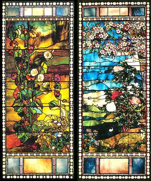
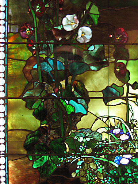
I stated that I saw windows that feature custom-made pressed glass inclusions. I took some pictures recently at the St. Louis Art Museum, where there are a set of LaFarge windows originally from Boston.
Here are both windows together -
Hollyhocks on the left and peonies on the right
Closer in on the hollyhocks.
This is a pressed glass flower from lower right area of hollyhocks window.
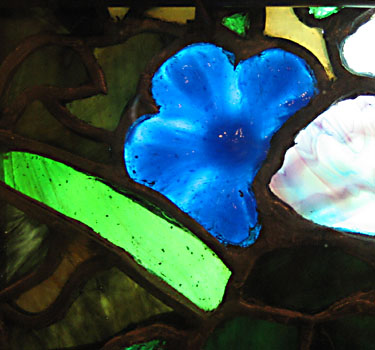
Pressed glass flower from peonies window.
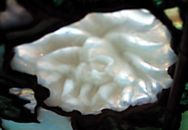
Another unique feature of the hollyhock window, a detail of a flower using no lead or copper foil - just a flow of solder between the pieces of glass.
March 04, 2006
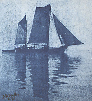
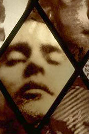
Pictorial Photography at the SLAM
I went yesterday to see the new exhibit, Impressionist Camera, at the St. Louis Art Museum. It's rare these days for me to see an exhibit for something interesting that I had never heard of, but I had never heard of "Pictorial Photography". It was interesting in the sense that these were artists who essentially did manipulated photography, not unlike what I've done with photography incorporated in stained glass. Though in the exhibit photos, almost all involve a manipulation of the chemical process of photography. In general, I like the spirit of technical experimentation in the service of creating new types of artwork.
from the cover of the exhibit brochure - and a detail of my own Eight Faces
 |  |
September 17, 2005
Landscapes at the SLAM
Early this month, I checked out "Nature and the Nation: Hudson River School" at the St. Louis Museum of Art. An exhibit of American Landscapes from the Wadsworth Athenaeum in Connecticut. I went not for the landscapes, which don't do much for me, but because it was from the Wadsworth, the first art museum I ever visited on my own in the late 70's near where I grew up in Connecticut. The Wadsworth at that time made a big impression on me. It's not a big museum but it has an interesting collection, with the surrealist items making the biggest impression at the time. The thought of surrealists was ironic since practically the first picture I saw in the SLAM landscape show was this curious piece of proto-surrelaism in the midst of the dour landscapes - "Gremlin in the Studio II" by Martin Johnson Heade
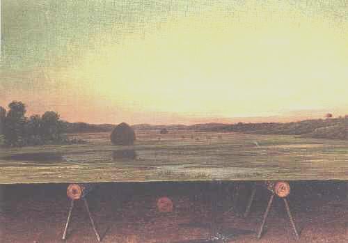
This is a trompe o'eil with a typical Heade marsh landscape above and below a view of the sawhorse type things holding up the landscape and a crudely draw stick figure of a 'gremlin' doing a little jig underneath the landscape. Very odd.
All that and I still like Heade's still life paintings and bird/flower paintings much better.