March 04, 2010
Mad Tea Parties Compared
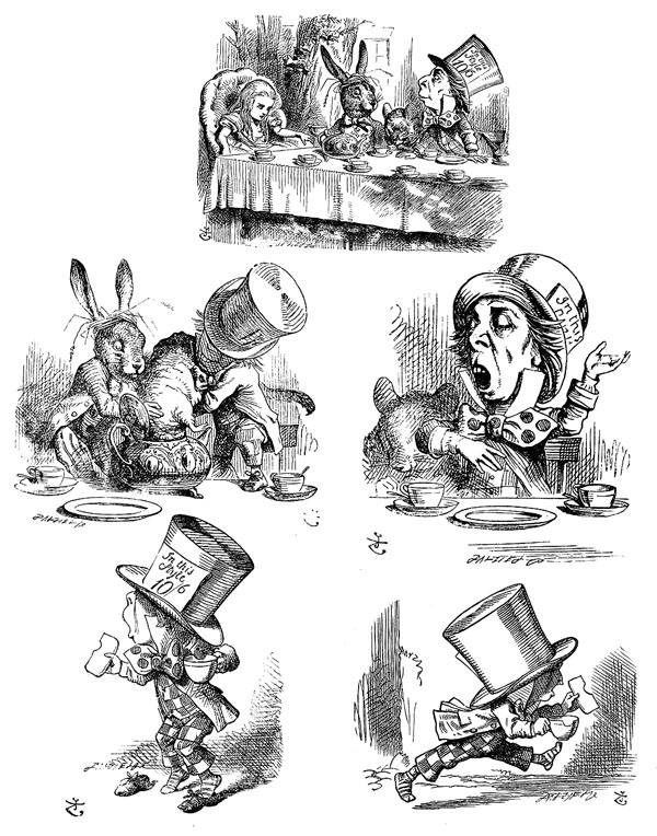
Since my most popular blog post remains the one on the Alice Windows in Daresbury, and there is a big new movie version of Alice in Wonderland coming out tomorrow, I'd thought I'd look at some comparative takes on the Mad Tea Party scene. Here is the original text for The Mad Tea-Party, with the Tenniel illustrations.
I'm putting the scenes in no particular order. Starting with the 1966 version directed by Jonathan Miller. Even though this is one of the weirdest, and least "Tenniel-based" of the adaptations, it is also one of the most true to the words and structure of the scene. I'm a sucker for great British character actors, and this is loaded with them. Peter Cook's trippy and mesmerizing version of the Mad Hatter is memorable.
Seven more variations of the scene below the fold...
Meryl Streep in a musical version of Alice - huh?
1983 TV sersion with Kate Burton as Alice and Andre Gregory as the Mad Hatter
a version from 1985 with some pretty strange casting choices (Telly Savalas as the Cheshire cat?!) including Anthony Newley as the Mad Hatter and and Roddy Macdowell as the March Hare. This is notable as one of the few live action versions that actually casts a real child as Alice, rather than a teenager or adult as Alice.
The 1952 Disney version. Being a Disney version, it is the one least like the Carroll original. Ed Wynn did the voice for the Mad Hatter, and Jerry Cologna for the March Hare.
1933 Hollywood version with Edward Everett Horton as the Mad Hatter
only found it over 2 sections
starts at 7:25
then the first 2 minutes of this part
if those disappear, there is this crude recorded version as well, that at least give a sense of the general approach.
this is from Dreamchild, from 1985,
written by Dennis Potter, of 'Singing Detective' Fame.
Bad video but gives the sense of the treatment of the scene
a much darker treatment it is, too
Jim Henson's workshop did the puppetry
Peter Sellers as the March Hare and Dudley Moore as the Dormouse
with weird musical outbreaks
Curiously, this is the second version of Alice in Wonderland to have Peter Sellers in the cast. He was the King of Hearts in the 1966 Jonathan Miller version.
1999 version. Computer graphics have crept into the mix with the CGI oversized heads. Martins Short as the Mad Hatter. This is another lousy recording but the only one I could find embedded.
I also could not find the whole thing in one place. There is a not terribly good or funny song and dance number right after this. Auntie's Wooden Leg, from the 1999 version of Alice in Wonderland.
And, of course - Why is a Raven like a Writing Desk?
Carroll refused to answer for a long time, but eventually came up with this - Both produce flat notes, neither of them musical
some other have suggested -
Edgar Allen Poe both wrote on one.
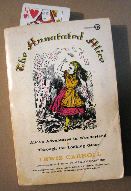
and finally, just to prove my long time Alice creds, here is a picture of my 25 year old well worn copy of the essential guide to Alice, The Annotated Alice by Martin Gardner. Along with appropriate bookmark.
June 05, 2007
'Alice in Wonderland' - a study in translation
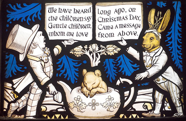
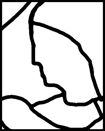
I saw a postcard of this Mad Hatter panel a few years ago and always suspected it was part of a larger program of panels. Indeed it is and the full Alice in Wonderland Window can be seen as part of the website for the church where it's located - All Saints Church in Daresbury, England.
SG photography by John Eastwood
It turns out that the Mad Hatter panel is in the center of 5 small 'Alice character' panels below a larger Nativity scene.
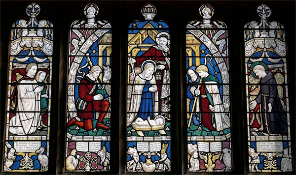
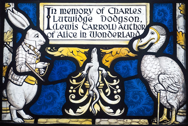
The window was created in 1935 to mark the 1932 centenary of the birth of Lewis Carroll and was created at All Saint's because it was the parish where Carroll was born (as Charles Dodgson). Lewis Carroll and Alice Liddell are depicted in the leftmost lancet. The stained glass is by Geoffrey Webb, who was a student of Charles Eamer Kempe. Stylistically, especially as regards the nativity scene, that makes sense as Kempe tended toward this kind of color scheme featuring the starkly white figures with shots of color in the clothing and background. (Bio of Geoffrey Webb - scroll down about a quarter of the page)
The design for the all of the 'Alice in Wonderland" characters are, of course, based on the famous illustrations designed by John Tenniel. I thought it would be interesting to get a detailed look at how closely the original illustrations, designed by John Tenniel, were translated into stained glass.
Mostly pictures, with some written commentary - going left to right -
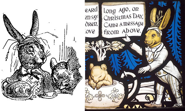
White Rabbit and Dodo Panel
The stained glass panel.
The original illustrations in full.
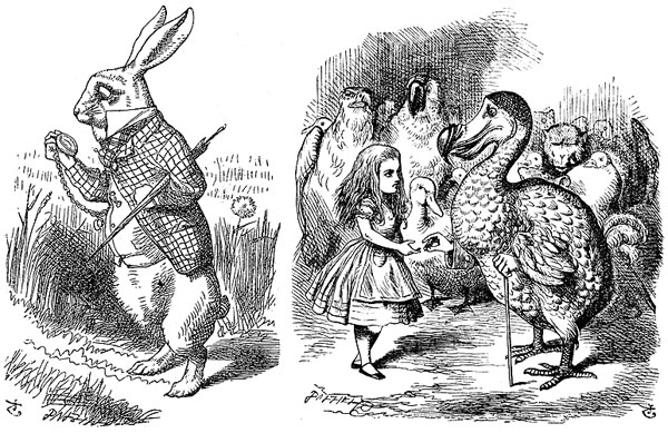
As expected, the stained glass figures have less cross hatching and feature more thick black lines. All the characters are surrounded by a fairly thick line of black. The translation to color is not jarring seeing that all the characters are on clear glass with accents in yellow silverstain. Keeping the characters all white against a dark color background gives more of the impression that the figures have stepped off the pages of the printed book. The yellow adds color which keeps them from looking too flat, yet the use of stain is subtle and doesn't overwhelm.
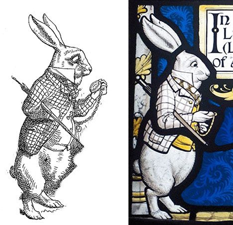
White Rabbit illustration and stained glass designs side by side
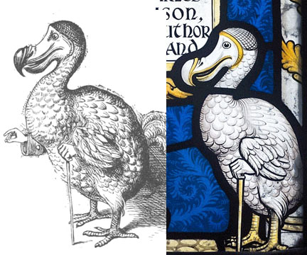
Dodo designs side by side
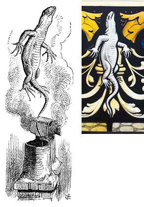
Lizard designs side by side
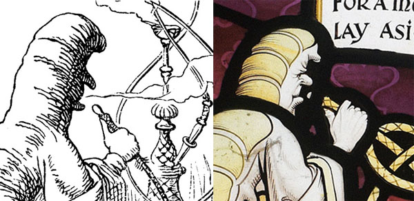
Caterpiller and Fish Footman Panel
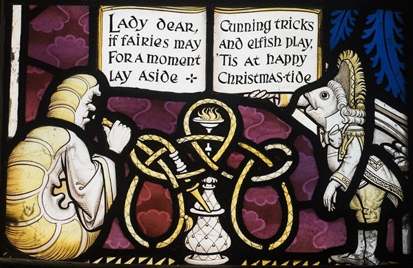
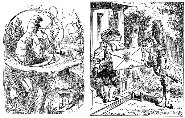
This example shows how the SG designer will sometimes take an element in the illustrations and transform it to something more conventionally stained glass like. I refer to the hookah pipe in the stained glass which, compared to the illustration, curves in a much more symmetrical fashion, much more like a decorative knot pattern one might find in a stained glass window.
Fish Footman designs side by side
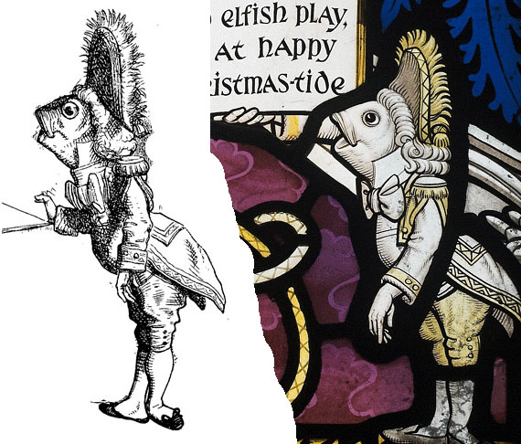
Throughout, the hands are proportionally larger in the stained glass figures and more clearly delineated. They are also, to my eye, more noticably 'human' hands. The hands are human in the prints as well, but the hands in the prints are smaller and sketchier, not calling attention to themselves as much. The Frog Footman is a good example.
The caterpillar is unique in that the SG designer sees fit to delineate a face where there was only a shadow in the original illustration.
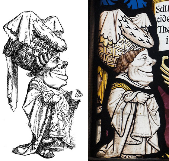
Mad Hatter, Dormouse and March Hare Panel
The Mad Hatter is the one character whose design does not derive directly from any of the Tenniel illustrations. It's curious since the Mad Hatter is depicted five times in 'Alice in Wonderland', more than any other character save Alice herself.
The head of the March Hare is derived from the main tea party scene though the Hare's body is original to the stained glass. The dormouse is roughly taken from the main tea party scene, though again the SG designer makes the hands larger and curiously more realistic human-looking hands.
Duchess, Griffin and Mock Turtle Panel
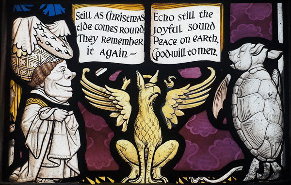
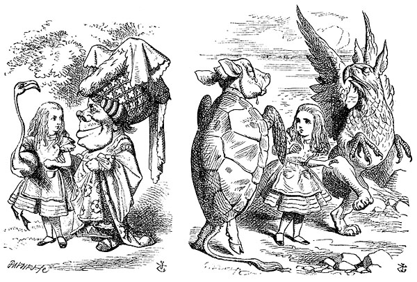
Note that only the head of the Griffin is derived from the above illustration(reversed) while the design of the body and wings of the griffin is new to the stained glass and again are more 'stained glass like, note the symmetry. The wings, especially, look more like Kempe than Tenniel.
Duchess designs side by side
Mock Turtle designs side by side
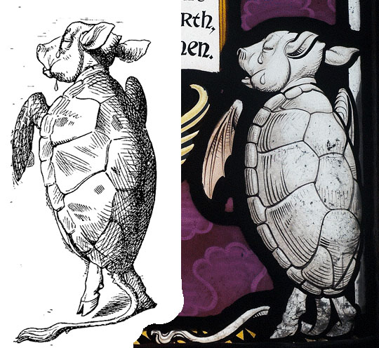
Note the linework. Both are beautiful in their own way but they are different interpretations. Both are, in fact, translations of an original design by Tenniel.
Many assume the original illustrations are pen and ink drawings by Tenniel, but they aren't. In the printed version, the linework was interpreted by the wood engraver, in this case by the Dalziel Brothers. Tenniel drew in pencil on a whitewashed block of wood and the lines were created by carving out the areas of white and leaving the areas representing black lines raised on the wood block.
In the case of the stained glass, the linework was interpreted by painting black lines on glass with a brush. With a brush, there is a more curving line and a greater emphasis on thin to thick lines.
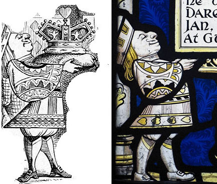
Knave and Queen of Hearts Panel
This is the only panel that features two full figures coming from the same illustration.
Queen of Hearts designs side by side
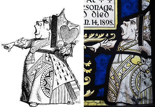
One thing that pops out to me is how the ornamentation on the clothing has changed from illustration to stained glass. The stained glass features heart designs on the clothing while the printed illustration does not.
Knave of Hearts designs side by side
January 01, 2006
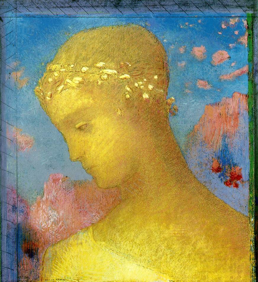
Redon Revisited
I have mentioned in the past how I felt the artwork of Odilon Redon would work well translated into stained glass. The other day I was thinking of this while playing in Photoshop -
the original image - a pastel by Redon called "Golden Cell", circa
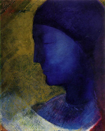
with some leadline added - does make the design heavier, but to my eyes it still works well -
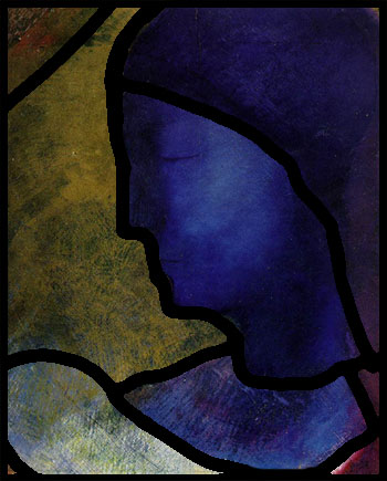
and here are how the leadlines would work out -
September 04, 2005
The Comics Thing
I came across this page with a reading of the Good Samaritan window at Chartres Cathedral. Here is the diagram - it's bigger when you follow the link
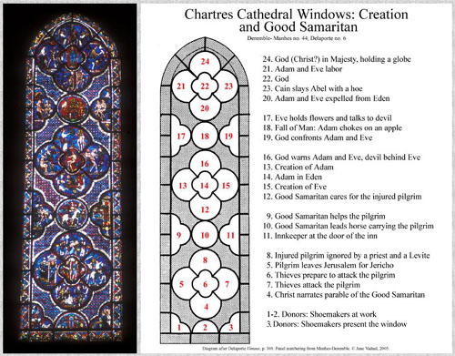
I have long thought of the possibilities of stained glass as 'sequential art'. This page reminds me once again that there is a precedent for it. I witnessed this window being 'read' as a story by the long time English guide at Chartres, Malcom Miller, and I remember thinking at the time - this thing is a comic strip!
The Good Samaritan/Creation window is especially interesting to me in that it translates so directly into the form of a modern comic strip, except that it goes bottom to top rather than top to bottom. It certainly has panels with gutters - gutters being the bands of space outside story panels that are usually blank, but here are highly colorful and ornamental.
I also love the sophisticated narrative. Two stories on top of each other that then relate to each other. The telling of the Good Samaritan first, then the story of Adam and Eve. The idea being that the act of compassion by the Good Samaritan is a metaphor for Christ's act of compassion in sacrificing his life for fallen man - Christ is the Good Samaritan. Unfortunately, this sequential element was never developed further in stained glass past the 14th century or so, and certainly does not exist at all today.
March 26, 2005
The Comics Thing, pt 1
Good online press for the comics world.
There is a multiple article issue on Art Spiegelman in Indy Magazine Winter 2005.
Also, there is a week long series on Robert Crumb at the Guardian website.
In both, there are lots of pictures and lots of background text. The comics art of the past 30-40 years has not had much of an impact on stained glass, with the primary exception of Judith Schaechter.... more on that tomorrow...
November 12, 2004
German Expressionism - Ripe for Translation 2
I've long seen the potential for stained glass design in the works of the Expressionist painters and printmakers of the first half of the 20th century. The art features a strong use of black, vivid color, and a content filled with intense emotional figurative content.
There seem to be few stained glass windows made in that period or in that style. The only one I've ever see by a German Expressionist of that era is a window by Max Pechstein at the Busch Reisinger at Harvard. And they do not have a picture (or a mention) on their website and I never got a picture of it when I lived in Boston. I seem to remember it being a good size window (perhaps 3 feet wide by 8 feet tall?) with a female figure and some stylized animals. I remember there being an interesting use of flashed glass effects but I also remember the figure not being too striking. I'm not sure if the window was made before or after World War 2. I know Pechstein made other windows but I've never seen any pictures of them.
There tends to be so much more attention focused on the Post-war German glass artists than on Pre-war glass artists. Post War German stained glass artists mostly work in abstract or stark austere designs. Hardly ever figurative at all - Stockhausen being the only exception I'm aware of.
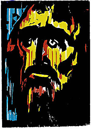
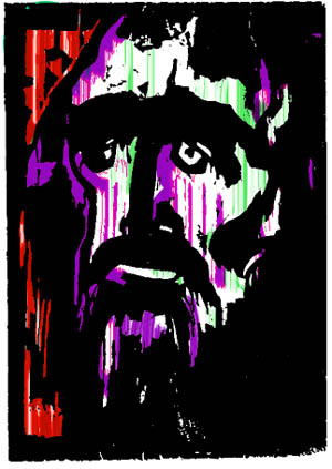
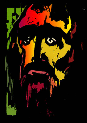
By way of demonstration - I've been playing with an image by Emil Nolde. A woodcut that always struck me as an image that could easily translate into stained glass.
Original woodcut print by Emil Nolde -
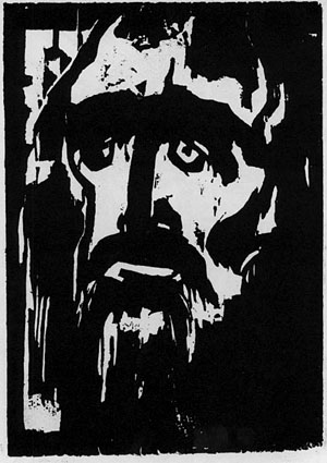
One 'Expressionistic' color possibility -
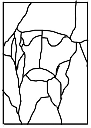
The leadline would be very simple using flashed glasses -
Now the coloring on this is actually more conventional, with blue for 'sky' or background and red seeming to symbolize 'blood'. Nolde himself, in his colorwork, very often did not go with natural or logical colors. That is, a background might just as easily be a bright harsh yellow as any other and a bright green might be on the face. So, here is another color possibility - perhaps more in line with the expressionistic dissonance of color -
Now if this were made into a more traditional, purely mosaic, style stained glass window - with color seperation NOT happening throught the use of flashed glass or colored enamel. The result might be more like this - the gradation of color could be acheived by careful selection of glass -
In this case the leadwork would be more complex, something like this
March 17, 2004
Ripe for Translation 1 - Redon
I have long been fascinated (some might say obsessed) with the question -
What different graphic approaches could be applied toward the design of stained glass?
In much the way that Tiffany used Impressionistic and Hudson River School ideas to influence his design work (especially in his Landscape windows). In much the same way that LaFarge used Japanese and a whole slew of other approaches to influence his design. I'd like to share some thoughts and impressions of artists and graphic approaches that might inspire new design directions in stained glass.
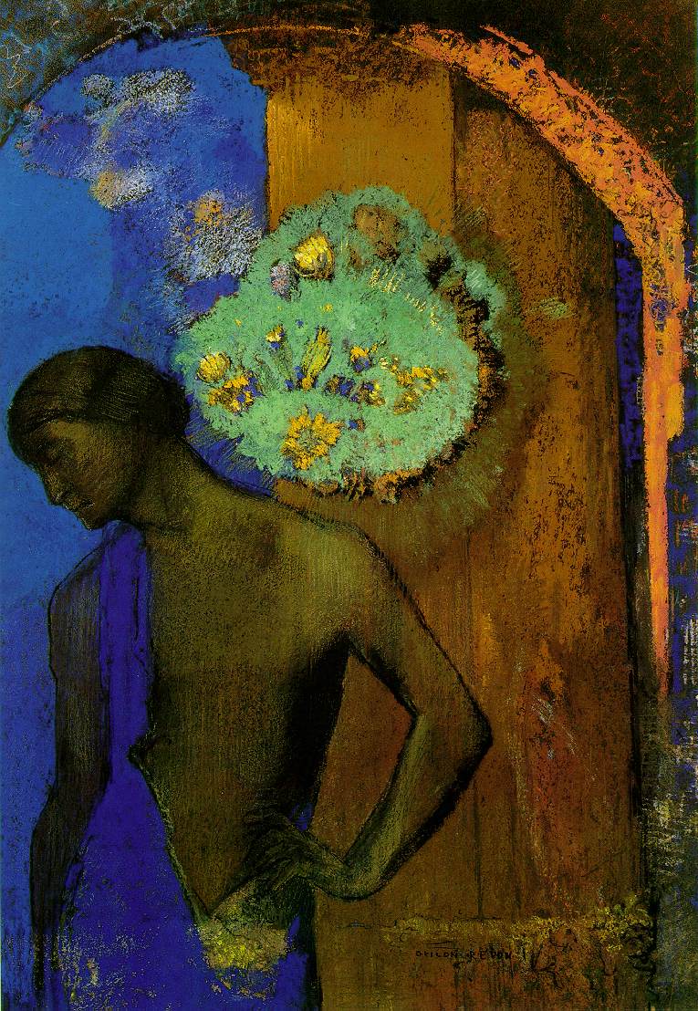
I love the work of Odilon Redon, french Symbolist artist (1840-1916), and it's always been difficult for me to pin down why. There is an indistinct quality that is appealing. the words evocative and thoughtful spring to mind. There is a pull toward the mysterious that, to me, lends itself to spiritual art and that does not seem to have been explored in depth by many actually designing stained glass.
Check these out and think how they might translate into the design of stained glass windows - just as examples, try his Beatrice and St. John.
There is one artist and one work that may resemble what I would envision a Redon-inspired stained glass work to be like. The St. Bartholomew War Memorial window in Ottawa by Wilhelmina Geddes. This also happens to be a favorite window of mine, in terms of concept and execution. I have strong memories of seeing this window in person, even though it's been nearly 20 years. I have not ever seen the entire window reproduced in print and would love to see an article on it - hey, why not a whole book!
[update 9/2007 - updated link to Geddes page, though there is no picture now on that page - just a link to a pdf of an article from Irish Arts Review of 1994, which does have a picture of the window]