April 30, 2010
For Digital Images, Resolution Matters
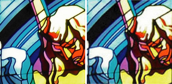
Nearly everyone in stained glass now archives and promotes their work using digital images. Because of this it is important to understand the concept of image resolution and to be able to determine whether an image is high or low resolution. The image on the left is high resolution and on the right it is low resolution. Using low resolution images in marketing your work can make you look sloppy and unprofessional.
So, resolution matters.
Richard Gross of the Stained Glass Association of America recently published 2 articles called "Resolving Resolution" in the Winter and Spring 2010 issues of Stained Glass Quarterly. He goes on at length about the cameras, and what pixels are, etc.
My take on it is simple - think in terms of pixels. You don't even need to know what a pixel is exactly. What you do need to know is how to determine what size an image is in pixels. Then, if you know how the image will be seen (web? inkjet printing?, book publication?), you will know if the digital file is usable. It takes a little getting used to, but it really is quite simple.
A little further explanation, a few graphics and a handy chart below the fold...
Resolution is determined by the number of pixels per inch. The more pixels, the higher the resolution. In general, you want to start with the highest number of pixels you can.
So, the general rule is that the higher resolution the better. But what if you've been given a file and want to know if it will work for what you need it for?
How to determine what is a low resolution image or a high resolution image?
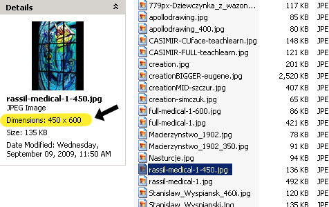
First, look for the dimension in pixels. You can do this from a folder on your computer. You do not need computer graphics software.
Select a digital image on a windows PC and you will see the specifications for that image appear to the side. I've highlighted where to look. This shows that the image is 450 pixels wide by 600 pixels high, which is low resolution.
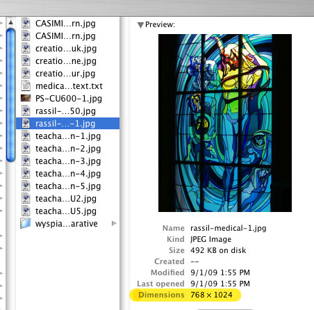
Here is the way it looks on a Mac, and again the dimension is in pixels. You will note that this is a slightly higher resolution, at 768 pixels wide by 1024 pixels high. This could used, in a limited manner, in digital printing but still would not pass muster in offset printing, unless printed very small..
Next, how to tell if the file you have is usable for the task at hand?
Are you using an image for a website or blog? Or for digital printing, which would include home or office printing on inkjet or laser printers. Are you submitting images to be printed in a magazine or book, where the image will be printed on an offset press?
This is a chart that shows how different resolution images size up in different output scenarios. As you look across the chart you will see how big the image will be in the 3 different scenarios, without image degradation.
Click on the image to see a larger image, or download the Resolution Chart PDF
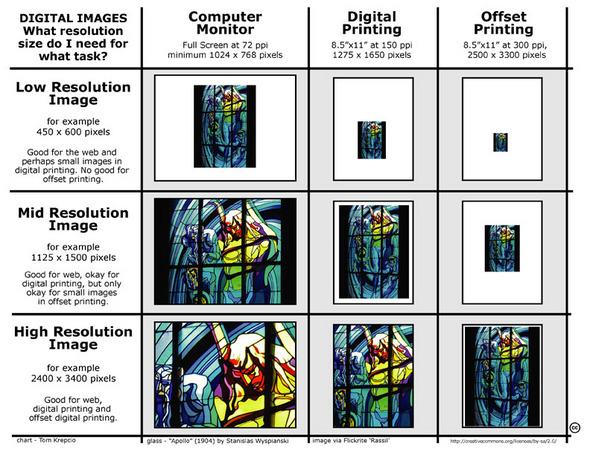
Keep in mind that this is a general rule of thumb and does not cover every situation. Not to mention the obvious, that if you do not have a high quality photograph in the first place, if it is out of focus or poorly lit, then the resolution is irrelevant.
One key rule to remember.. You can turn a high resolution image into a low resolution one, but you can never turn a low resolution image into a high resolution one. It will look jagged and fuzzy and terrible. Always take your digital pictures at the highest resolution, especially if you ever think they might be printed at any time in the future. You will have much bigger files to deal with, but the trade-off is worth it.
You're a professional. Look like it!
April 28, 2010
Conrad Schmitt Videos
This is a pretty slick promo for the Conrad Schmitt Studio, a big multi-generation studio out of Wisconsin. No credit as to who made the film or when, though my guess is that it was made in the early 80's.
Be forewarned, the style of narration is a bit dated and the music is a bit over the top, especially in the otherwise interesting section showing glassblowing at Blenko glass, where they overlay the scene with movie western cowboy music.
Part ll, Stained Glass 1
Part ll, Stained Glass 2
Very clean.
April 23, 2010
Alice for the iPad
No, it's not stained glass (though it does have a glowing screen), but Alice in Wonderland does pop up rather frequently on this blog... and this is without a doubt the coolest thing that I've seen related to the iPad.
April 17, 2010
BIG Halftones in Architecture
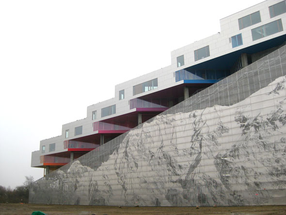
Bjarke Ingels: 3 warp-speed architecture tales - a TED talk
Danish architect Bjarke Ingels rockets through photo/video-mingled stories of his eco-flashy designs. His buildings not only look like nature -- they act like nature: blocking the wind, collecting solar energy -- and creating stunning views.
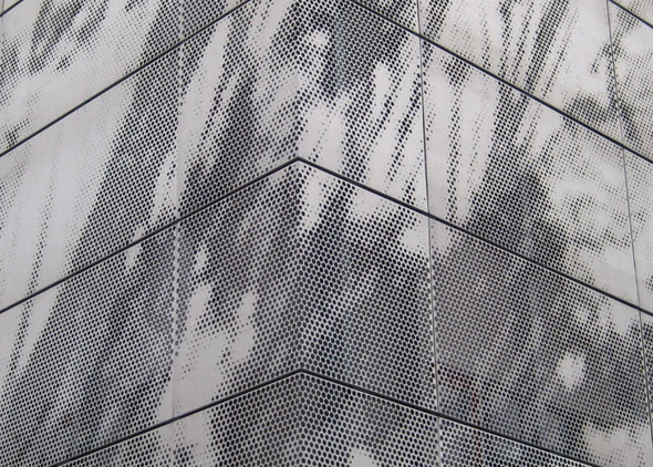
The most interesting part for me is the third project, 'The Mountain Apartments", where he uses the halftone process, but applied in a uniquely architectural manner. If you want to see just that bit, it's from 12:43-13:15. The whole video is just over 18 minutes long.
These images are from Flickrite roryrory, who has posted quite an impressive collection of images of contemporary architecture.
Exterior of the building focusing on the photo of Mount Everest.
Closer Exterior of a corner of the building, where the halftone dots are just becoming visible.
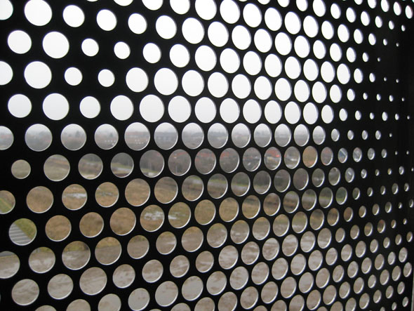
Interior showing the holes in the metalwork clearly
April 07, 2010
Who Made Me?
To my surprise, I found even more on the topic of signatures in Stained Glass on Flickr. This time it's a pool called Who Made Me?, which specializes in church art signatures. Currently, 244 out of the 856 images are of stained glass window signatures. Again, an incredibly useful resource. You can do a search for stained glass within Who Made Me?.
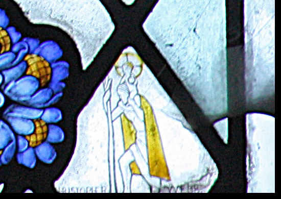
Since I featured a Geoffrey Webb window in the last blog post on signatures in stained glass, I seems only fair to this time feature his brother, Christopher Webb.
The Lord's My Shepherd Photo by Lawrence OP
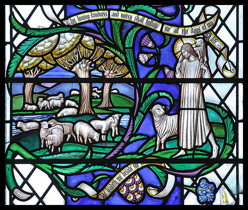
In this case the photo of the full window is so large that you can go and look at the detail of the signature, which in this case is a little St. Christopher.
I should note that this Flickr pool, like the other Flickr set, is only covering British windows.
America lagging behind? Say it ain't so.
April 05, 2010
Judith Schaechter on Friday Arts
There is a video now available called 'Friday Arts for April 2, 2010' (no embed available), from a broadcast on Philadelphia Public TV. I'm not sure if they have any other name for it. No matter, since the only important thing is that the first section is about Judith Schaechter, contemporary stained glass artist extraordinaire. She starts at about a minute in and goes to about 7:25. Judith is just finishing work for a new exhibit at Claire Oliver Gallery, opening May 22. The new pieces look amazing, upping both the technical and graphical limits of her work. She's been updating the progress of these panels regularly on her blog, Late Breaking Noose. Go back several months and check them all out. Well worth it.
Detail, The Minotaur, stained glass panel, Judith Schaechter, 2010
April 01, 2010
Signatures in Glass
Flickr continues to amaze me.
I found today a page called Signatures in Glass, from Flickrite 'Budby'. There are 96 images, all from English Churches. What a useful and amazing resource for a stained glass researcher, or conservator. And it's fun to browse through, as well.
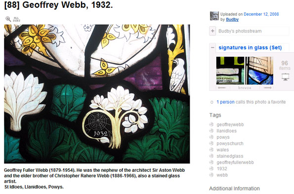
One screenshot as an example - Geoffrey Webb signature